
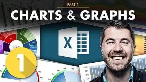
Excel Data Visualization Part 1: Charts & Graphs

Self-paced course
Certification program
Price
Rating
Overview
This class is Part 1 of a two part Excel data visualization series, designed to give you a deep, 100% comprehensive understanding of Excel's latest data visualization tools and techniques.
In this section of the course I'll introduce key data visualization tips and best practices, guide you through interactive, hands-on demos and exercises, and show you when, why, and how to use each of the 20+ chart types that Excel 2016 has to offer, including:
- Bar & Column charts
- Histograms & Pareto charts
- Line charts & trend lines
- Area charts
- Pies & Donuts
- Scatter plots & Bubble charts
- Box & Whisker charts
- Tree Maps & Sunbursts
- Waterfall & Funnel charts
- Radar & Stock charts
- Heat maps, 3-D Surface & contour charts
- Chloropleths & Geospatial maps
- Custom combo charts & graphs
- Sparklines
Once you've mastered the basics, Part 2 is all about putting your skills to the test, with advanced demos and case studies that you won't find in ANY other course, guaranteed.
Whether you're looking for a quick primer, trying to diversify your Excel skill set, or hoping to step up your data viz game in a major way, this series is for you.
What are the requirements?
- Microsoft Excel, ideally 2016 for PC (some charts are not available in earlier versions of Excel)
- Mac users are welcome, but note that the user experience will be significantly different across platforms
What am I going to get from this course?
- A step-by-step, 100% comprehensive guide to visualizing data using charts & graphs in Excel
- A deep understanding of WHEN, WHY, and HOW to use 20+ chart types in Excel 2016
- Exclusive data visualization tips, tricks, and best practices from an award-winning analytics expert
- Unique, custom content that you won't find in ANY other course
Who is the target audience?
- Anyone looking to create beautiful, custom data visualizations in Excel
- Excel users who have basic skills but want to master advanced charts, graphs & dashboards
- Students looking for an engaging, hands-on, and highly interactive approach to training
Learning outcomes
Post this credential on your LinkedIn profile, resume, or CV, and don’t forget to celebrate your achievement by sharing it across your social networks or mentioning it during your performance review
Similar courses


Featured articles
3832 students
English
Advanced


